The process of creating the digi-pack front cover, back cover and inside pages was a long drawn out process as it was considerably important to get the precise design that we wanted. In particular it was important that the final design would appeal to the target audience and included the conventions of a pop-rock bands music product. Specifically, the final stages of creating the digi-pack meant incorporating the micro elements, for example the institution logo, barcode, sponsors etc. Whatever we thought was as close to a real media product as possible. This also included inserting the lyrics in the inside pages.
Due to Rachel being the artistic one of our partnership she played a key component to re producing a real media product. During the finalisation of the digi-pack she began with the back cover of the album taking into account the layout and information that must be included due to them being common conventions. Therefore, the information included was marginally just a case of observing what similar real media products included. As Boys Like Girls are the key band related to Lost In Colour because of influence and genre it was simple to see what we must include.
Boys Like Girls album back cover:
Boys Like Girls album back cover:
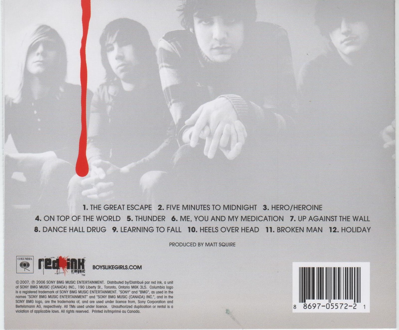
The key components that can be observed from viewing this back cover is the layout and information that they have incorporated to make it appear professional as well as aesthetically pleasing. The smaller elements of the overall package are potentially more important than the big elements, therefore looking at the copyrights, legilastion rights, etc. on the back cover was important as we MUST include it. As you can see on this example of an album cover, the small print is about the institution 'Red Ink Music' and the distributors. The bands personal website has also been included, a common occurrence not only with other album covers but also with band magazine adverts, advertising their new single. The bar code has also been placed at the bottom left of the back cover, the reason being due to the way we looked at a cover; left to right, therefore this appears last as it is least important and unrelated to the overall product design.
Which i felt the layout of this was more natural, as people read from left to right, so it felt natural to have the least visually pleasing aspect as the last thing the audience reads. The layout is very colloquial and has a simple flow to it, therefore using Rachel's expertise through using Photoshop we were able to achieve a similar, professional outcome with Lost In Colour's digi-pack.
Which i felt the layout of this was more natural, as people read from left to right, so it felt natural to have the least visually pleasing aspect as the last thing the audience reads. The layout is very colloquial and has a simple flow to it, therefore using Rachel's expertise through using Photoshop we were able to achieve a similar, professional outcome with Lost In Colour's digi-pack.
Rachel has provided some screen shots of the process she went through at home when using Photoshop to design the overall digi-pack.
Back Cover:
Back Cover:
Here Rachel shows the process of selecting the institutional logo and transferring it onto the back cover, so it is effectively branded, on previous blog posts you will notice our chosen institution: Epitaph.

Below is the process of entering the well known Copyright symbol, warning the public that it is illegal to share this product. This Copyright symbol was included due to it appearing on other album digi-pack's we looked at and also due to it being a necessity to prevent fraud. Also we included small print information about the institution, distributor, the band details such as album release dates and so on.


Above is a personalised version of the small print information which was found to be a comon convention with real media product, this paragraph was primarily influenced by the paragraph on the back of Boys Like Girls album. Included is also the bands official website, seen to be included with all music artist album covers, not only bands. You will notice that we have also used a colloquial layout, much like Boys Like Girls back album cover.
Here is the process of adapting a barcode and incorporating it on the back cover:

The front album cover was a much simpler process when designing in comparison to the back cover. The factor that we discussed in greatest detail was the typography to use as it was important to catch the audiences attention, however through the primary research questionnaire (question 14) that I conducted it made the task much easier. The answer was 'playful' with 44% of the public choosing this answer, therefore we aimed to make the font as playful as possible. This involved making the font larger and underlaying the red font with black creating a shadow effect, not only was this to make it stand out more to the target audience, but it was also to meet the similar conventions of pop-rock genre bands.
Below is a print screen of this process in Photoshop:

Next part of the final stages was to produce the inside pages, Rachel experimented with multiple layouts in order to identify which was the most colloquial, a few of the initial designs are below:

The first initial design is provided above, you will notice that the imagery of the band in the background is similar to Boys Like Girls back cover image. Images of the band members was also a common occurrence when looking at other bands digi-pack, inside pages. You will notice from this first design that the lyrics that we wished to include did not completely fit on, the right hand page (although would be covered by the CD) was also left fairly bare.
However, one of the most successful elements of this first design of the inside pages was the way the image of the band in the background is faded meaning the lyrics can be easily read, Rachel did this by the below functions on photoshop:

This technique that Rachel used, which was similar to the overlay effect in our music video was included in our final design due to the success of it. Also, rather than using the whole image of the band members we just incorporated their faces, alongside the persons name and position in the band e.g. vocals. A common convention in rock band digi-pack's, the purpose of this is to make the audience feel closer to the band member as they know more about them. The lyrics were also rearranged to make the inside pages appear more colloquial and make the page appear less empty, therefore they ended up in a two page spread. In order to link with the front cover typography of 'Lost In Colour' Rachel incorporated red in text when introducing the band members, therefore it did not appear completely random.
No comments:
Post a Comment