In order to ensure that the digi-pack linked to the music video we took elements from the music video and experimented by turning the print screen images into cartoon images and in general mixing the images up. We felt the image below considerably reflected the connotations in the song, especially the variety of stereotypes.
Rachel used this image as a base layer to produce the cartoon album cover below.
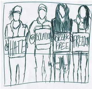
Above is a very rough sketch done by Rachel showing how she would reflect the different stereotypes. Through displaying the signs, the intended connotations can be witnessed in the music video and digi-pack. However, during discussion Rachel and I felt that this composition was too busy as an album cover and would not appeal to the audience.
This image from the music video also inspired us:
Rachel also experimented with changing this image into a cartoon composition for the album cover:
This album cover in the form of a cartoon done properly could be considered as an effective album cover, however Rachel and I felt that a photographic image would be more appealing and realistic, from research we found that the target audience also want this. Creating the album cover in the form of an album cover would not suggest reality, which is the main purpose of the music video, therefore they would not link.
This resulted in Rachel experimenting with photographic images for the album cover.
The above album cover can be considered as a much more striking image, therefore it is more likely to catch the audience’s attention. It also corresponds with the music video, reflecting the reality and connotations of it.
During this stage we also began to look at typography, and what current albums in the market are using. A great example is from the Arctic Monkeys:
Although the font here is considerably small it is still effective and creates an impact. Through using this smaller font it has resulted in the image being the main attraction, something that we want in our digi-pack, due to photographic imagery being a key component to Lost In Colour. The colour of the font; black, also considerably stands out due to the contrast against the white background.


No comments:
Post a Comment